Free library
UX Laws, Principles & Guidelines
50 laws and guidelines from the ProUX library, free to read. Each one names the issue, the fix and the takeaway, with sources.

Principles
Decision & simplicity laws (7)
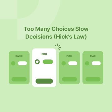 131Hick’s LawHick's Law says that the more choices you give someone, the longer they'll take to decide. When people face too many options, making a decision becomes…
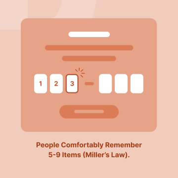 133Miller’s LawMiller's Law states that the average person can hold about seven (plus or minus two) items in their short-term memory. In simpler terms, most people can…
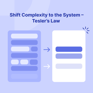 137Tesler’s LawTesler’s Law states that every system has a certain amount of complexity that cannot be eliminated. The goal is to shift this complexity from the user to…
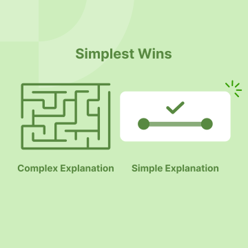 146Occam’s RazorOccam's Razor is a simple principle: when faced with multiple explanations or solutions, the simplest one is usually the best.
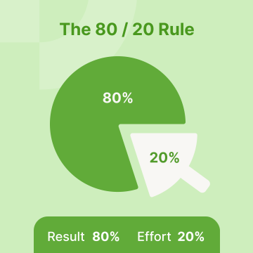 139Pareto PrincipleThe Pareto Principle, also known as the 80/20 Rule, means that 80% of results come from just 20% of your efforts. This concept highlights how a small…
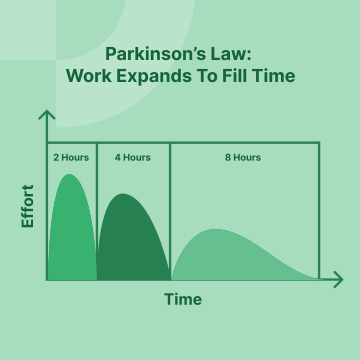 135Parkinson’s LawParkinson's Law states that work expands to fill the time or space available for its completion. In simple terms, if you have more time or resources than…
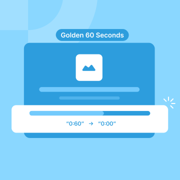 140Doherty ThresholdThe Doherty Threshold or the "Golden 60 Seconds" refers to the critical first minute of using a product or website. In that short window, users decide…
Interaction laws (4)
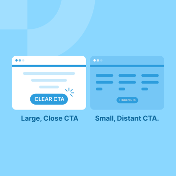 132Fitt’s LawFitt's Law explains that the time it takes to click or tap on something depends on two things: how far away it is and how big it is. Simply put, larger…
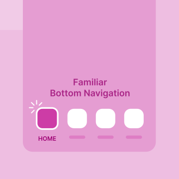 134Jakob’s LawJakob's Law states that users prefer your app to work like the ones they already know. Since people spend most of their time using familiar apps and…
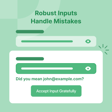 136Postel’s LawPostel's Law, also known as the Robustness Principle, advises that systems should accept unexpected or incorrect inputs without failing. In simple terms…
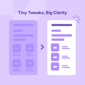 144Weber’s LawWeber’s Law is a psychological principle stating that the smallest noticeable difference in a stimulus is proportional to its initial intensity. In design…
Gestalt principles (6)
 149Law of ProximityThe Law of Proximity is a design principle that states we naturally group together items that are close to each other. In simple terms, when related…
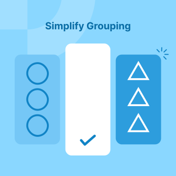 147Law of SimilarityThe Law of Similarity is a principle from psychology that explains how our brains naturally group similar items together. When elements look alike - in…
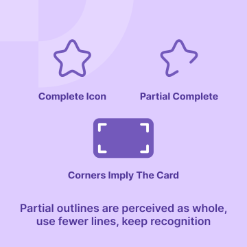 194Law of ClosureThe Law of Closure means people naturally fill in missing parts of a visual to see it as complete. In UX design, this helps create interfaces that feel…
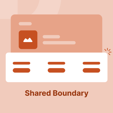 148Law of Common RegionThe Law of Common Region is a design principle that states we naturally group together things that are inside the same area or boundary. Think of items…
 151Law of ContinuityThe Law of Continuity is a design principle stating that people naturally follow smooth lines and patterns. When elements in a design flow seamlessly…
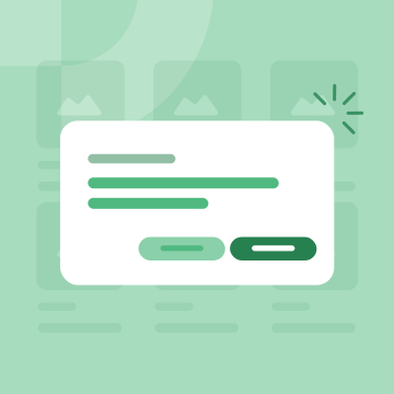 150Figure-GroundFigure-Ground is a design principle that helps us see what's important on a page. Think of it like this: the "figure" is what you need to notice, and the…
Core UX concepts (8)
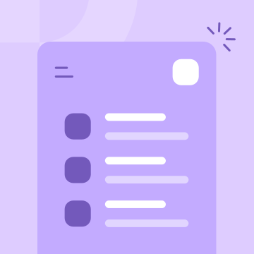 168Cognitive LoadCognitive load refers to the mental effort required to process information and complete tasks. In websites and apps, it measures how hard users have to…
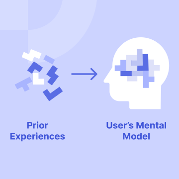 170Mental ModelA mental model is how users believe something works based on their past experiences and knowledge. It helps them understand and predict how to interact…
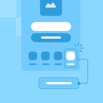 161AffordancesAffordances are design features that indicate how an object or interface should be used, allowing users to understand possible actions without needing…
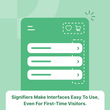 163SignifiersSignifiers are visual or audible cues like buttons, icons, or sounds - that show users how to interact with elements on a website or app. They make your…
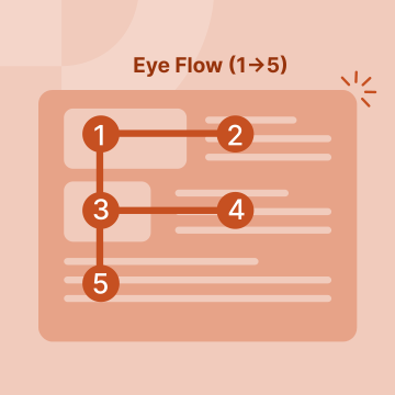 179Visual HierarchyVisual hierarchy is a design principle that arranges elements to guide the viewer's eye to the most important information first. By manipulating size…
 152Progressive DisclosureProgressive disclosure is a design approach that presents information to users gradually. Instead of showing everything at once, it reveals details step…
 164FeedbackFeedback in design is information given to users about their actions and the system's responses. It keeps users informed about what's happening, ensuring…
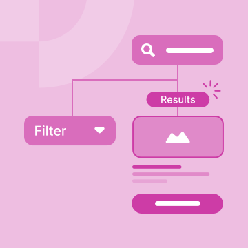 162DiscoverabilityDiscoverability is how easily users can find content or features on your website or app. It involves making important information visible and accessible…
Memory & attention effects (6)
 128Aesthetic & Usability EffectThe aesthetic-usability effect is the idea that people perceive attractive designs as more usable and functional, even if they aren't. When something…
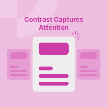 142Von Restorff Effect / Isolation EffectThe Von Restorff Effect, also known as the Isolation Effect, is a psychological principle that suggests people are more likely to remember something that…
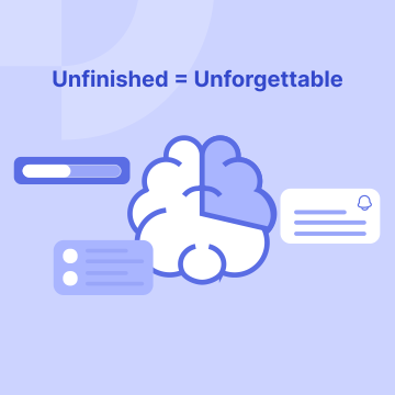 145Zeigarnik EffectThe Zeigarnik Effect is a psychological principle explaining why we remember unfinished tasks better than completed ones. When we leave something…
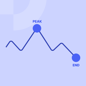 156Peak-End RuleThe Peak-End Rule is a concept from psychology that says people remember an experience based on two moments:
First - The Peak: The most intense or…
156Peak-End RuleThe Peak-End Rule is a concept from psychology that says people remember an experience based on two moments:
First - The Peak: The most intense or…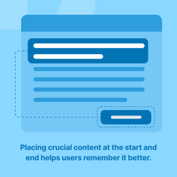 154Serial Position EffectThe Serial Position Effect is a psychological principle where people tend to remember the first and last items in a list better than those in the middle…
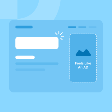 176Banner BlindnessBanner blindness occurs when users ignore content that looks like advertisements, even if it's important. Over time, people have learned to skip over…
Guidelines
Trust & transparency (5)
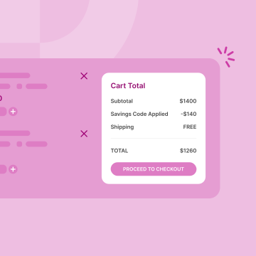 502Be Transparent with Total Costs to Build Trust and Keep CustomersShowing all costs upfront including item prices, shipping fees, taxes, and any extra charges—makes shopping easier for customers. It builds trust, reduces…
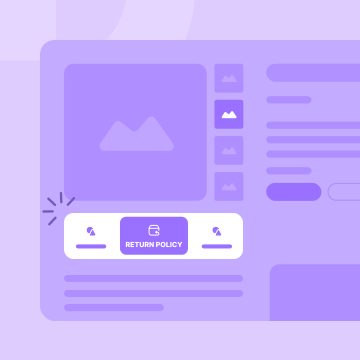 475Why a Clear Return Policy Matters in eCommerce UXA clear and visible return policy isn’t just a checkbox - it’s a core part of designing a user-centered eCommerce experience. For designers, grasping why…
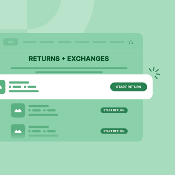 553Make Returns Easy: Build Trust and Boost SalesWhen returning items is simple, customers feel confident shopping with you again. Easy returns make them more likely to buy in the first place.
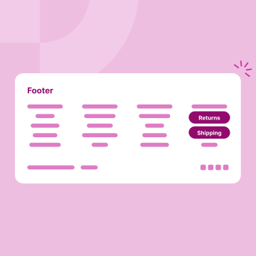 402Make Return & Shipping Info Easy to Find in the FooterPlacing clear links to your return policy and shipping details in the website footer gives customers instant reassurance about what happens after they…
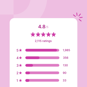 473Why Rating Distribution Charts Are Essential for Trust in eCommerceA rating distribution chart shows how many reviews a product has for each star rating. This simple tool builds trust and helps users make faster, more…
Mobile experience (4)
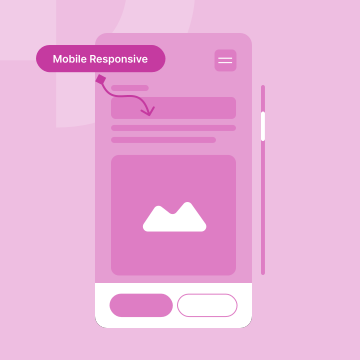 766Ensure Every Page Works Well on Mobile Devices to Keep Users Happy and EngagedEnsure that every page on your website is optimized for mobile users. If not, visitors may become frustrated and leave your site.
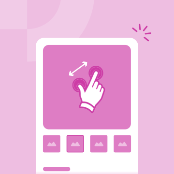 466Enable Pinch-to-Zoom for Product Images on MobilePinch-to-zoom is a simple gesture that lets users enlarge product images on their mobile devices. This feature is essential for eCommerce because it…
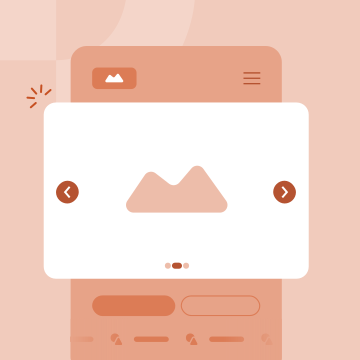 758Improve Mobile Experience by Removing Auto-Rotating CarouselsMake your website friendlier for mobile users by removing slides that move on their own. Instead, use still images or let users control them manually…
 755Speed Optimization Guidelines for eCommerceA slow store loses shoppers before they see the product. Lighter code and a CDN keep pages quick enough to convert.
Product content that sells (4)
 463Boost Sales with the 3-5 Image Rule for eCommerce ProductsIn eCommerce, product images are key to helping customers decide to buy. The 3-5 Image Rule means every product should have at least 3 to 5 high-quality…
 769Essential Product Image Angles - A Quick Guide for eCommerceDisplay products from multiple angles to create an immersive online shopping experience that builds customer confidence and drives sales.
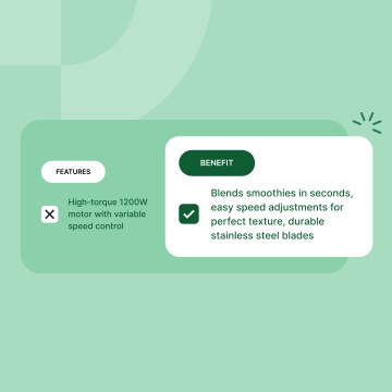 474Use Clear and Simple Product DescriptionsProduct descriptions tell customers what a product does and why it’s useful. They should be easy to read and understand, helping shoppers make quick…
 756Make Your Website Text Easy to Read and Engage VisitorsSimple changes to your website's text can make it easier to read, encouraging visitors to stay longer and increasing the chances they'll make a purchase.
Finding & buying flow (6)
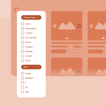 601Help Customers Find What They Want Fast with Smart FiltersUse filters that make sense for each product category. Think about what customers are looking for and design filters to match.
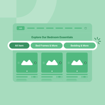 403Prominently Highlight Main Categories on the HomepageClear, visible category links on the homepage help shoppers instantly understand what you sell and quickly find the section they want.
 760Fancy Menus Can Confuse Users: Stick to Familiar Navigation for Better ResultsFancy or unconventional menus might look interesting, but they often confuse visitors. Stick to menu designs that people already know to make your website…
 503Make Cart Access Easy to Reduce Abandonment and Increase SalesAfter a customer adds an item to their cart, they should clearly see how to view their cart. This helps them feel confident and reduces the chances…
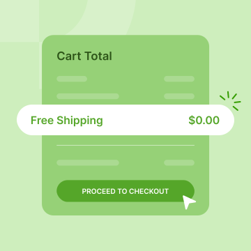 513Increase Cart Completion by Making Free Shipping Crystal ClearTo boost conversions, make free shipping information impossible to miss in the cart. Clearly state shipping costs and any thresholds that qualify for free…
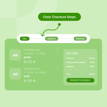 520Clear Checkout Steps for Better UsabilityWhen customers can easily see where they are in the checkout process with honest, easy-to-understand steps and clear labels, fewer people leave without…
Questions
Applied questions (10)
Show shipping cost first. Asking for an email before revealing what delivery costs trades goodwill for an address the visitor will resent giving, and…
Read the full answerYes, for almost every store. Forcing account creation before purchase adds a step that serves you rather than the buyer, and first-time visitors are the…
Read the full answerMore than you need to complete the order. There is no correct number, because the cost of a field is not uniform: a field someone can answer without…
Read the full answerSomewhere it does not prompt a search. A prominent empty coupon field tells every buyer that a discount exists and they do not have it, which sends them…
Read the full answerYes, but only ones that mean something. A recognised payment mark or a real security certificate reassures; a generic badge with no issuer does not, and…
Read the full answerUsually because something changed or something failed. The total grew with shipping or tax, the preferred payment method was missing, a card was declined…
Read the full answerYes, as early as you can produce one. Delivery timing is a purchase criterion, not a post-purchase detail, and a buyer who cannot find it either leaves to…
Read the full answerKeep everything the buyer entered, say what happened in language they can act on, and offer a clear next step. A decline is not the end of the order…
Read the full answerOffer the methods your buyers actually use, which is usually more than you expect and fewer than everything available. A missing method is an absolute…
Read the full answerWhat was ordered, what it cost, when it arrives, and what happens next. It is the last moment of the purchase and the most disproportionately remembered…
Read the full answer

AI Product Designer
19 years designing products, mobile first, grounded in UX psychology.
Founder of ProUX.